BRAND IDENTITY
Leading an in-house team of creatives, we built our new identity from scratch focusing on a complete brand and design system. Where each touchpoint, from our products to marketing, is distinct and unique to our new brand identity. The new look and feel was unveiled on our brand microsite, Indeed Design.
Designed to integrate the visual design of our products and solutions, the new system reflects the pace of our evolution and helps us deliver on our belief that Indeed is here to help everyone get jobs. All people. All skills. All levels.
Through meticulous curation, we crafted a color palette with a set of hues, tones, and contrast ratios to build a robust system that honors where we’ve come from and where we’d like to go. This range of colors not only provides enough grades for interacting with our product, it also accommodates the variety of ethnicities and skin tones that show up in our illustration style.
In partnership with Dalton Maag, we created a custom typeface, Indeed Sans, that is contemporary and personal. It adds warmth, clarity, and positivity to our brand voice in expressive moments, underscoring the empathic way we support people through some of the most exciting — and challenging — parts of their career journeys.
This long-term strategic initiative was accomplished with the collaboration of our executive leadership team. Some of the new designs have already launched, and more will be showing up in the coming months.
IDENTITY SYSTEM
As part of the Brand Creative Department, I led a team of designers, writers, videographers and animators on establishing the identity system for Pinterest.
These guidelines showcased the foundational elements of our brand, creating a flexible system for our internal teams and external partners to use. As Pinterest neared its public offering in April 2019, it was important to build consistency in our brand identity.
This strong foundation for our creative was applied through multiple channels/verticals for teams to leverage across the company.
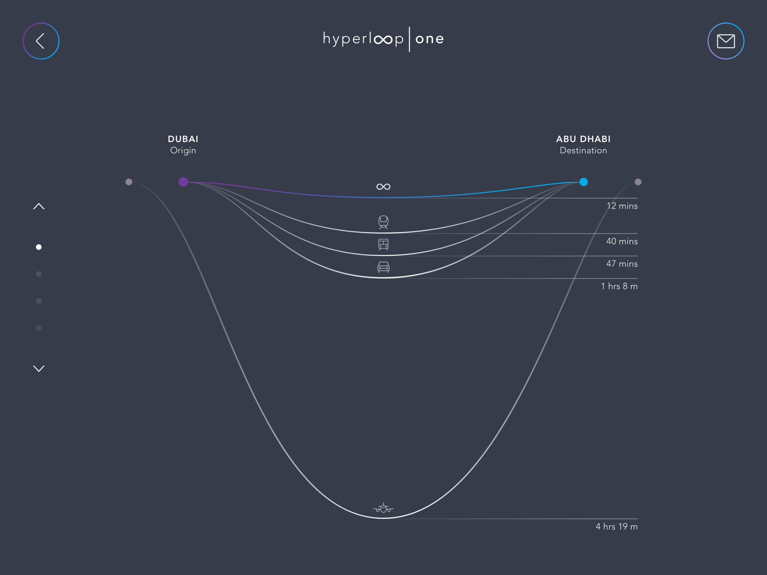
BRAND STRATEGY/IDENTITY
My creative team and I engaged with Hyperloop One in driving the direction behind the brand identity for this disruptor in transportation technology.
From the ground up, I worked on developing their brand strategy, created the new company logo name/identity, and designed their entire brand system.
As Hyperloop One grew to be a global organization, a set of guidelines were needed to provide creative direction for both the visual design and overall brand messaging. This document would be used by their partners across various channels from digital to print.
Included in this Brand Manual are detailed descriptions on the narrative tone, brand messaging, writing guidelines, logo usage, color hierarchy, data visualization, custom photography, animation style and much more.
Every piece of this Brand Manual was written, shot or designed by my team with careful precision in every detail. We're very proud of seeing how far this company has come and glad we could help play a hand in the next mode of transportation.
MULTIMEDIA KEYNOTE
Who wants to be a billionaire?
That was the question I was prompted while working with this eccentric Icelandic billionaire. The author of Billions to Bust - And Back Again, Thor Björgólfsson, embarked on a promotional press tour to share insights from his new book.
We collaborated together on the development of his keynote that he would use to present at a conference and workshops across the world Through a mix of multimedia and interactive design, this keynote was show on-screen as well as through digital tablets so that the audience could engage with the content while Thor presented.
Like children listening to a tale around a campfire, this new form of creative storytelling became a dynamic way to make the audience feel as though they were part of the journey.
PRODUCT DESIGN / USER EXPERIENCE
With the success of the product launch event we created for Hyperloop One, I was asked to lead the creative direction behind their new app for mobile tablets. This interactive app will be released to the public and is currently used at events through specialized kiosks.
With a team of talented developers, we shaped how our work on the brand would be translated into an engaging user experience through touch devices. This new layer of interaction with an audience would allow them to connect directly with Hyperloop One and their mission to create the next wave of transportation.
Careful thought and consideration was given for each touchpoint, allowing the user to navigate their own journey and making sure each moment felt genuine. Real-time information is pulled directly from all over the world so we can bring people interested in this innovative technology closer together.
The app is currently built for an iOS platform and will shortly be available on Android devices.
INTERACTIVE ADVERTISEMENT / SOCIAL CAMPAIGN
My team and I developed an interactive advertisement that was displayed on a digital kiosk to promote the efforts of this nationwide non-profit program.
The focus of this organization was to eliminate the "stigma" of poverty and create a campaign to showcase a community of innovators. Similar to a start-up, they would work with donors to focus on empowering these individuals by giving them the tools to push past the poverty line.
The design and artwork from this interactive piece were also used as social assets as part of the marketing campaign promotion across the country.
BRANDING DESIGN / PRODUCT LAUNCH
The brainchild project of Elon Musk, Hyperloop One became a reality on May 10th, 2016.
For this historic moment of their initial working prototype sled, I was lucky enough to lead the creative direction behind the launch of this milestone which included designing a new logo, brand guidelines, developing their thought leadership keynote and orchestrating the event launch.
With an incredible team of designers, motion artists, cinematographers, strategists and account services, we worked with the leadership team behind Hyperloop One to bring this moment to life through interactive displays, animated videos, lead-in campaigns as well as rebranding their identity before the launch.
This successful product launch led to their next investment funding phase for Hyperloop One and created a global excitement that had over 40 billion media impressions worldwide (i.e. including Jimmy Fallon).
Just for comparison, the Super Bowl usually generates 4.3 billion media impressions. No small feat.
Incredibly proud of this moment and lead the team behind the launch.
REBRAND LAUNCH
Gap Inc. went through some hardship these past few years with the loss of a Creative Director, closing down over 5,000 stores and bringing on a new CEO into the mix. The morale was low and employees were unsure of the company's new direction.
Collaborating directly with the in-house Brand and Marketing team, we helped developed the company's new mission statement and visual direction as part of their rebrand launch. This video was the output of that collaboration where it used the history of the company to help paint the future for all of Gap's brands: Gap, Old Navy, Banana Republic, Athletica, Hill City.
Under this new direction for the video, we developed the photography style, iconography and layout treatments that will be used moving forward as the corporate brand. This laid out the foundational elements for their identity and creates a fresh take on a long-lasting consumer brand.
LOGO AND IDENTITY REBRAND
Tononto-based, Index Exchange, asked me to rethink their entire visual identity and rebrand their 27 year-old identity from top to bottom.
This was no easy task since the history of the company has been so engrained into their look and feel, but it was a worthwhile challenge in making something modern that could also last for the next few decades to come.
Their mission is to automate the future of the world’s information and become the progressive platform for our partners to become better programmatic sellers in an everchanging landscape. Using the "platform" as a concept, we worked together to create a logo mark that could be versatile and have ever-changing movement.
From print, web, digital, to video, this was represented in a variety of mediums that ushered in the new age for Index Exchange and became a movement both their employees and partners rallied championed for.
MULTIMEDIA ANIMATION
Designed the visual style and directed the animation for Imperva CounterBreach. As the first in a series of motion pieces, my goal was to create a simple visual narrative that could easily communicate the complex challenges that face internet security.
This animation was spread virally through Imperva's YouTube Channel and used for social marketing initiatives to drive attention to their marketing channels. From directing the voiceover talent, creating the visual style and editing the animation itself, this animated piece lead created a very successful return for the client as well as inspired the latest rebrand for the identity of the company.
INTERACTIVE WEBSITE
Working closely with the in-house Global Integrated Marketing team at VMware, we developed an interactive website to announce their product suite as part of VMware's Multi-Cloud Strategy.
User-experience played a strong role in the development of the design since most scenarios would call for their audience to interact with this site over a tablet or other mobile device.
Every interaction was accounted for so that the user had full control over the narration of the story through the visuals, revealing additional information through select touch points and .
Although the audience for this was mainly B2B (Business to Business), our goal was to cover the human-centric story behind the technology and placed a lens on the individual people using this technology that made this effort successful through it’s relatablity.
SOCIAL MARKETING VIDEO
Working at an agency means digging your hands deep on a variety of content/design. This includes subject matter that may prove difficult to digest, but a message that needed to be said.
For Compassion International, I was fortunate to help educate the world on the global issues of poverty and create a compelling social marketing video that presented this information in a powerful way.
By using a combination of strong imagery and infographics, we were able to build awareness around the need to eliminate poverty by empowering those around us to take action. This viral marketing campaign was supported by creating an additional microsite, posters and printed infographics.